UX
UI
Machine Interface Redesign
Industrial HMI for Steel Profile Cutting & Laser Marking
Overview
This project focused on redesigning the user interface for a highly advanced industrial machine used for cutting, punching, and laser-marking steel profiles. The legacy interface had been designed for highly skilled engineers and exposed most of the system logic directly through dense tables, parameters, and technical terminology.
A key advantage of this project was that the existing system was fully operational in production. This allowed us to ground the redesign in real-world usage rather than assumptions — observing how the machine was actually operated day to day, identifying pain points, and understanding where complexity truly mattered.
The goal of the redesign was to shift the interface toward a human-centered, task-driven experience that could be confidently used by low-skilled operators after minimal training, without reducing the machine’s capabilities or precision.
My role
Product Designer (UX/UI)
I owned the design process end to end — from research and concept definition through interaction design, high-fidelity UI, and validation in production.
Throughout the project, I worked closely with software developers on a daily basis, collaborating on feasibility, implementation details, and system constraints. Designs were continuously tested, reviewed, and refined together with the engineering team, allowing us to quickly validate assumptions, incorporate feedback, and adjust the interface based on real technical and operational insights.
My responsibilities included:
Conducting on-site user research with engineers and machine operators
Translating complex machine logic into task-oriented, operator-friendly flows
Designing interaction models and visual language for an industrial HMI
Creating wireframes and high-fidelity UI designs aligned with hardware constraints
Iterating designs based on developer feedback and hands-on testing
Supporting implementation and validating the final interface in real production scenarios
This close designer–developer collaboration ensured that the final solution was not only intuitive and human-centered, but also technically robust, performant, and fully aligned with the underlying machine architecture.
Research & Insights
Unlike greenfield projects, this redesign benefited from access to a live, production-grade system. We spent time directly on the factory floor:
Interviewing engineers and operators responsible for daily machine operation
Shadowing users during real production cycles
Recording and analysing their workflows, handoffs, and workarounds
These observations revealed a clear gap between:
How the system was designed to be used
How it was actually used under time pressure and production constraints
Many operators relied on experience, intuition, or informal knowledge rather than the interface itself — a strong signal that the UI was not supporting their mental model.
Design Challenge
The legacy interface:
Assumed deep technical knowledge
Required constant context switching between tables and machine state
Increased cognitive load and error risk
Made onboarding slow and heavily dependent on senior staff
The challenge was not to simplify the machine, but to translate its complexity into an interface aligned with human perception, attention, and decision-making.
Design Strategy
1. Task-first, not system-first
Instead of exposing internal machine logic, the interface guides operators through clear, sequential actions, such as:
Load the profile into the TOP station
Move profile to punching station
Confirm detected shape
The UI explains what is happening and what action is required next, reducing ambiguity and hesitation.
All technical data remained available, but was intentionally hidden behind expandable, on-demand sections.
This allowed:
Operators to stay focused on execution
Engineers to retain full access to diagnostics and parameters
One interface now serves two very different user groups without overwhelming either.
3. Visual system state awareness
Abstract numbers were replaced or supplemented with:
Clear machine visualisations
Highlighted active stations and tools
Explicit status, warning, and confirmation messages
At any moment, operators can understand the current system state at a glance.
Design Process
The design process was highly iterative and tightly connected to real production conditions. From the very beginning, the focus was on progressive validation — testing assumptions early, reducing cognitive load, and ensuring the interface could be safely operated by low-skilled users in a high-risk environment.
1. Research & System Understanding
We started with deep contextual research, leveraging the fact that the legacy system was fully operational.
This allowed us to:
Observe real operators working with the machine in production
Conduct in-depth interviews with engineers and operators
Record machine operation sessions to understand workflows, errors, and mental models
Identify which data was critical in the moment, and which could be deferred or hidden
This phase was essential in reframing the interface from a data-heavy engineering tool into a task-oriented operational system.
2. Lo-Fi Prototyping & Flow Design
Based on research insights, I created low-fidelity wireframes focused on:
Clear task sequencing (what happens now vs. what happens next)
Reducing simultaneous choices and decisions
Replacing tables and dense data blocks with progressive disclosure
Defining system states and operator actions
Lo-fi prototypes were used to quickly validate logic, navigation, and information hierarchy with both engineers and developers before investing in visual detail.
3. Hi-Fi Interactive Prototyping
Once flows were validated, I moved into high-fidelity, interactive prototypes that closely resembled the final HMI:
Realistic machine visualizations replacing abstract data tables
Clear, directive system messages guiding operators step by step
Visual feedback for machine states, errors, and confirmations
Interaction patterns designed for touch and industrial environments
Hi-fi prototypes were actively used during discussions with developers to validate feasibility, performance constraints, and edge cases.
4. Continuous Iteration & Validation
Design did not stop at handoff. Throughout development:
Prototypes were refined based on engineering feedback
Micro-interactions and copy were adjusted after hands-on testing
Edge cases and failure states were added as they emerged in real usage
Visual and interaction decisions were validated against safety and usability constraints
This iterative loop between design, development, and real-world testing ensured the final interface was not only visually refined, but operationally reliable and intuitive in production.
Legacy Interface

Legacy, data-heavy interface designed primarily for experienced engineers.
Critical operational information was presented in large tables and technical parameters, creating high cognitive load and making the system difficult to use for less experienced operators.
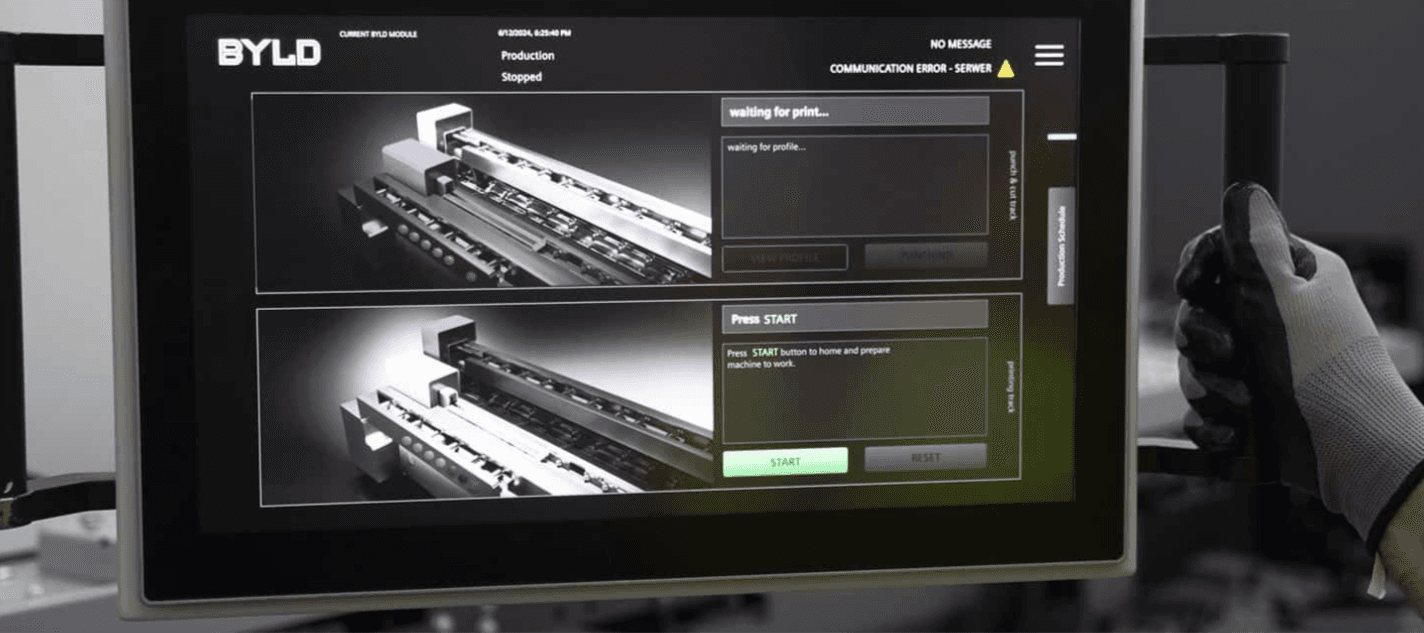
Redesigned Operator Interface

Task-driven, visual interface that guides operators step by step through the machine workflow.
Instead of dense tables, the UI focuses on clear instructions, real-time machine state, and visual feedback — enabling low-skill operators to work confidently with minimal training.
Contextual production data on demand

Instead of permanently exposing complex tables, detailed segment and part schedules are hidden behind simple swipe gestures on the production screen.
This approach keeps the primary interface focused on the task at hand, while still giving operators instant access to deeper production data when they need it — reducing cognitive load without sacrificing control or transparency.
System Thinking in Practice
The redesigned interface functions as a bridge between physical actions and digital control:
Operator inputs directly affect machine state and production data
Machine feedback is immediately reflected in the UI
The interface reinforces correct sequences and prevents invalid actions
Rather than acting as a control panel, the UI became a coordination layer between humans, hardware, and production logic.
Shared context across multiple displays

To reduce visual clutter on the main control interface, selected production information was moved to an external screen mounted above the machine.
This allowed operators to track overall progress, upcoming parts, and time estimates at a glance, while keeping the primary touchscreen focused on immediate, step-by-step actions.
Manual Control Mode

A dedicated manual mode gives operators direct control over individual machine components such as punching, cutting, embossing, and gripping. This interface was designed for exceptional and setup scenarios, prioritizing clarity, safety, and precise feedback while keeping advanced controls accessible without overwhelming the primary production flow.
Outcome
Reduced cognitive load during daily operation
Shorter onboarding time for new operators
Lower reliance on expert supervision
Fewer operational errors and safer machine usage
Most importantly, the machine became approachable and understandable, without becoming simplistic or limiting.