UX
UI
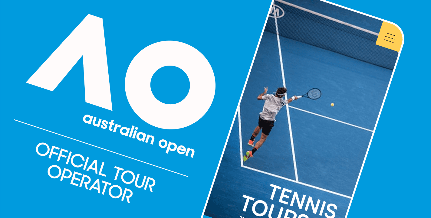
Tenis Tours
Designing a low-pressure booking experience for tennis travel
My role
User interviews and research
Insight synthesis and problem definition
UX strategy and user flows
Wireframing and high-fidelity UI design
Developer collaboration and design QA
Testing and iteration
Timeline
A three-month end-to-end process, from user research and wireframing through design, implementation, testing, and content preparation.
Overview
Relaksmisja is a boutique travel agency originally focused on tailor-made individual trips.
As the business expanded into themed group travel — including culinary, tennis, and photography trips — one category clearly stood out.
Tennis trips quickly attracted a dedicated audience.
Over time, a distinct group of customers emerged who were interested only in tennis-focused experiences.
This led to the creation of a separate brand — Relaksmisja Tennis Tours — and the need for a dedicated website built specifically for this audience.
The Problem
The existing website was not designed to support this shift.
Tennis trips were difficult to find and blended into a broad, unfocused offer
Different types of tennis trips were presented in the same way, despite very different user expectations
Booking a tennis trip is a high-consideration decision:
often expensive
dependent on group size
requiring trust and reassurance
A classic e-commerce checkout flow felt misaligned with how users actually made decisions.
Research & Insights
We conducted interviews with returning customers who had previously joined tennis trips.
Key insights:
“Tennis trip” meant different things to different users
Some cared primarily about training, others about tournaments or travel experiences
Most users were not ready to commit immediately
What they wanted first was clarity, confidence, and time to decide
The research made one thing clear:
users didn’t want to buy a trip — they wanted to explore it safely.
Reframing the Problem
Instead of asking:
"How do we sell tennis trips online?"
We reframed the question to:
"How do we help users decide if a trip is right for them?"
Product & UX Strategy
Clear segmentation of trip types
Based on research, we defined three distinct categories:
1) Travel + tennis + tournament attendance
2) Tournament-focused trips combined with sightseeing
3) Tennis camps focused purely on training
Each category had its own structure, content, and expectations — making it easier for users to self-identify and navigate.
2. Removing direct online sales
Rather than pushing users toward immediate checkout, we introduced a sign-up-first model:
Users could register interest in a specific trip
Trips moved forward once a group reached critical mass
Final details and contracts were handled directly by trip coordinators
This removed pressure while still supporting business goals.
Designing for confidence, not speed
The UX focused on:
clear information hierarchy
transparent explanations of what each trip includes
reducing uncertainty rather than driving urgency
The goal was not faster conversion, but better-informed decisions.
Design Process
The project followed an end-to-end product design process:
User interviews and insight synthesis
Problem definition and solution framing
Low-fidelity wireframes to explore structure and flows
High-fidelity responsive designs for mobile and desktop
Close collaboration with developers during implementation
Ongoing feedback, testing, and iteration
Wireframes and final screens were used to continuously validate design decisions against user needs.
Home page

Clear categorisation helped users quickly identify the type of tennis trip that matched their goals.
Product page

Rather than pushing checkout, the page focused on building confidence through details about accommodation, training, and the people leading the trip.
Mobile

The mobile experience preserved the same structure and decision logic, prioritising clarity and sign-up over visual density.
Outcome
The final platform helped clarify the tennis travel offering and align user expectations before direct contact with trip coordinators.
By structuring tennis trips around clear categories and replacing direct checkout with a low-pressure sign-up flow, users were able to make more confident, informed decisions.
Within six months of launch, the tennis trips segment saw a 48% increase in inquiries, which translated into an 18% growth in completed sales — validating the decision to optimise for confidence rather than immediate conversion.